What can I customize?
The Bespoke Site allows two levels of customization:
Basic customization: without changing the site’s structure, with this level you can modify certain elements such as the:
- background
- text fonts
- colour of the general theme
- presentation of the menu banner (shadow effect, rounded outline, etc.)
Advanced customization: with this level you can modify the site’s structure and implement specific developments such as:
- annotations on products (e.g. icon indicating a vegetarian dish, number of calories, etc.)
- search filters
- a list of favourites
- a tips/gratuities system
- limited number of orders by time slot
- step by step formulas
- upselling with tailored algorithms
With Advanced customization, the site’s layout is open, so anything is possible. Whatever level of customization you choose, it will require the intervention of a platform engineer, a graphic designer and an HTML/CSS developer from the LivePepper team.
What do I need to provide to create a Bespoke Site?
To create your site, simply send us all the graphic elements that you have (e.g. printed menu, flyers, logo, pictures of your products/dishes, website, etc.) along with your specifications. If necessary, one of our project managers can help you establish your specifications. We will then proceed on the basis of these elements to create the first layouts of your site, which will be submitted for your approval before starting on the engineering task. This phase may well involve a number of exchanges back and forth until you are satisfied. Allow at least 5 to 6 weeks for the setup of a bespoke site. Once your site is deployed, you resume full control of it.
Where can I get my inspiration from for my site?
If you decide to draw up your site’s specifications yourself, you can find plenty of inspiration on the Internet by looking for the kind of site design you want. In France, some of our customers draw their inspiration from the sites of McDonald’s, Domino’s Pizza and Sushi Shop, among others. Sites already created by LivePepper may also serve to inspire you. You will find some on our Portfolio page.
Examples of Bespoke Sites
Here are some examples of bespoke sites that we have constructed.
Neds Noodle Bar
Specific feature: Possibility of composing the main dish in 4 or 5 steps. This kind of page layout is possible for sandwiches, pancakes, pizzas, burritos or any other product that customers can compose themselves online. “Neds Boxes” page – with the possibility of composing the main dish – Neds Noodle Bar site 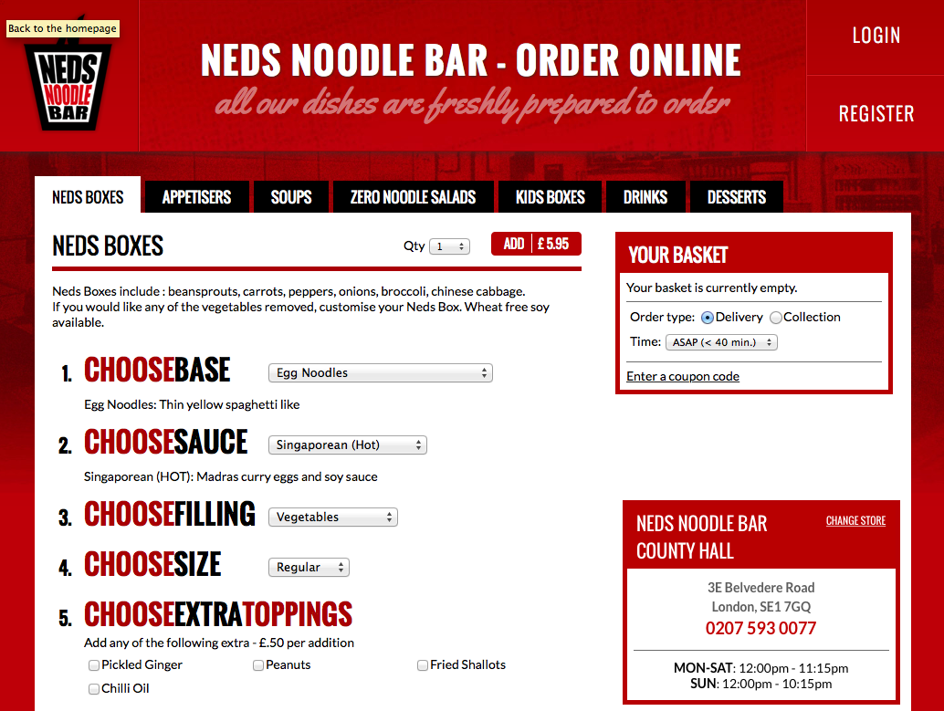
Herbies Pizza
Specific features:
- Icon-based presentation of products to facilitate ordering on mobile devices (photos provided by Herbies).
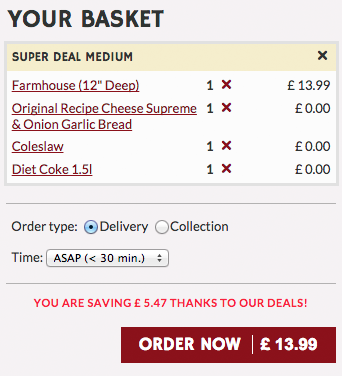
- Optimized display of promotions (“Meal Deals”). The products included in the Deal are selected step by step on the page, without any pop-ups. Savings made per order are shown in the basket. During the order confirmation step, this information is repeated and the customer is informed of the number of loyalty points acquired.
“Your basket” page – including an indication of the savings made – Herbies Pizza site
“Loyalty programme” page – including an indication of the number of loyalty points acquired – Herbies Pizza site

Ker Juliette
Specific features:
- Icon-based presentation of products.
- Optimized display of menus with the products included, presented step by step.
- Upselling in menus “A partir de 8€” (for €8 or more).
“Menus” page – possibility of creating your menu step by step – de Ker Juliette site 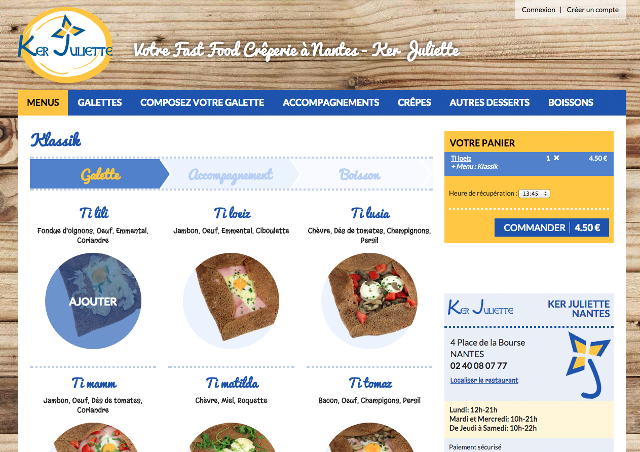
Pappa Ciccia
Specific features:
- Pappa Ciccia managers can customize the message below the basket to provide customers with additional information, e.g. new products, exceptional delivery delays.
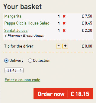
- Customers can leave the delivery person (“driver)” an online tip directly from the basket.
“Find your nearest branch” page – by entering the postcode – de Papa Ciccia site 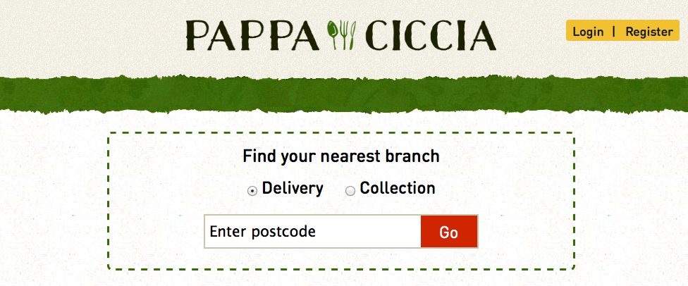 “Your basket” page – where customers can leave a tip for the driver – Papa Ciccia site
Zing Zing
Specific features:
- Designed by Richard MacVicar, the homepage allows users to search by postcode and offers modifiable promotional visuals.
- Tailor-made workflow to highlight Zing Zing’s “Freebies” loyalty programme.
- List of favourites.
- Integration of an online payment solution allowing users to enter their credit card details directly on the LivePepper site, without branching off to the bank’s site.
- Programmed in HTTPS to ensure secure customer data.
- Upselling depending on the basket’s contents to increase the average buy.
Example of upselling – highlighting of a given product depending on the basket – Zing Zing site 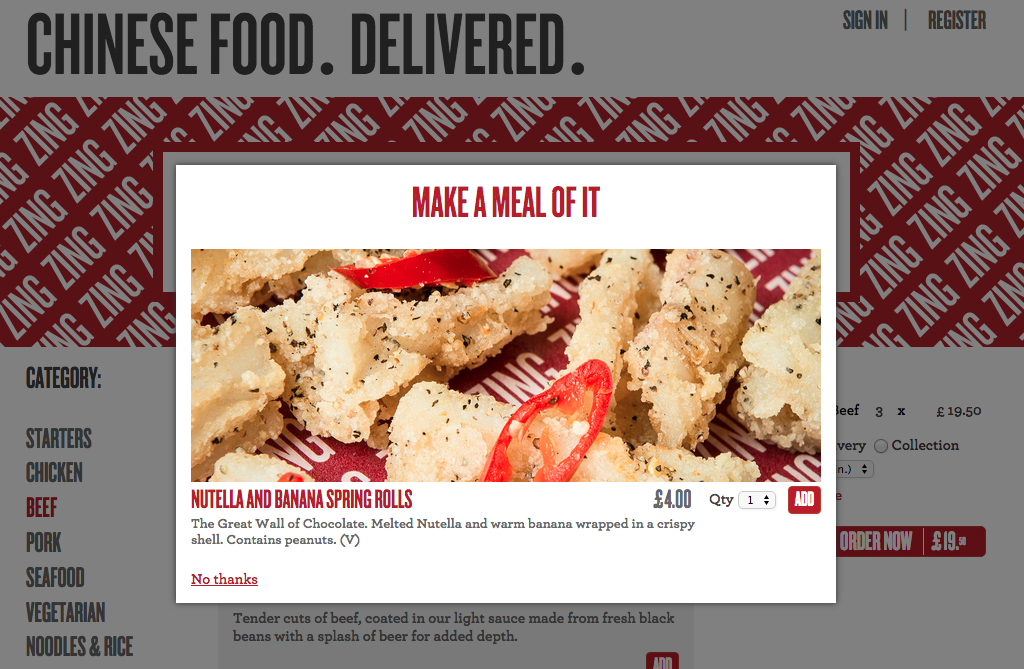
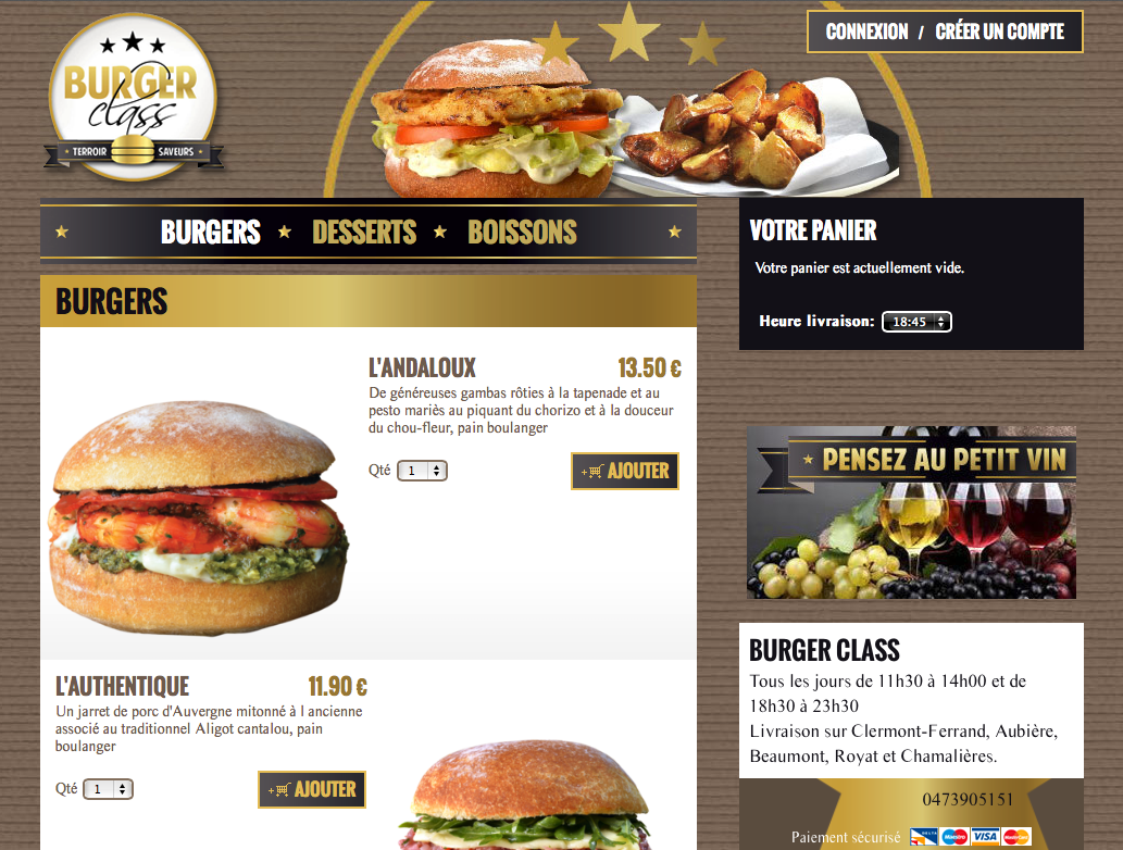
Burger Class
Specific features:
- Icon-based presentation of products to underscore the offer.
- Clickable image below the basket to encourage the visitor to add drinks.
Example of a clickable image: “Pensez au petit vin” (“Order a little wine”) below the basket – to encourage visitors to add a drink – Burger Class site 