A customer who can confirm his or her order with minimal delay
In the foodservices industry more than any other, the duration of the ordering process is key. Indeed, when customers place an online order, they are often already hungry! They are thus looking to collect their meal or have it delivered as quickly as possible. Here are some tips to meet your customers’ needs and allow them to tuck in as quickly as possible…
Fast-loading pages
We can never stress this enough: your website’s load speed is vital. Avoid including too many animations, and remember to use suitable image sizes.
Order history
By providing an order history, your regular customers will be able to order their favourite dishes or menus in just a few clicks. When they see that your restaurant “recognizes” them, they will feel that little bit more special.
Say it with pictures rather than words
Give preference to visual devices to communicate on your online ordering site. That way, you can convey maximum information in minimum time.
A customer who recognizes your restaurant’s universe on your e-commerce site
From the site’s homepage through to the email confirming their order, customers should instantly recognize that they are on your e-commerce site within the familiar context of your restaurant.  While the homepage on your online ordering site should be consistent with that of your corporate website, it should not merely repeat the same content. Here you can highlight your (new) online ordering service and its specific features. The homepage can also be disabled to avoid any duplicate content if this information is already visible on the corporate website. On all your site’s pages, be sure to assert your brand, include your logo, and adopt the visual codes in your graphic charter. You can also customize your site’s favicon. The idea is to create a familiar environment for your customers in order to establish markers and ordering reflexes over time…
A customer who is guided throughout the ordering journey
Via numbered steps
Numbering the steps in the ordering journey on your e-commerce site will allow your customers to see where they are in the ordering process and avoid growing impatient.
A clear, functional menu
Your online menu’s tree structure must be intuitive so that you customers know where to look for the products they want. Customers generally place products in their ordering basket in the order in which they intend to eat them. You should thus organize your sections accordingly:
- Starters/cold dishes.
- Main courses/hot dishes.
- Desserts.
- Drinks.
Set menus and promotions will be more visible if positioned in first or last place. If your dishes or meals can be composed by the customers themselves, guide them via the description by indicating the successive choices that they will have to make. For example, for a pizza that can be entirely customized, you could indicate the following in the product description:
- Choose your pizza type (thin/thick).
- Choose your base (fresh cream/tomato sauce).
- Choose your topping from 15 possible ingredients.
Order confirmation
Confirming a customer’s order is essential as it allows visitors to be sure that their order or booking has been accepted. Ideally, the confirmation should include the delivery/availability time of the products ordered.
A customer who has the right to make mistakes
 Remember to include a “Back to menu” button or a “Modify my order” button at each step in the online ordering process. In fact, customers may often change their minds at the last minute and choose, for example, to “have a dessert after all”… By clicking the “Modify my order” button, they can simply add the product and resume the process were they left off. This right to make mistakes is very important. If customers who have almost reached the end of process have to choose everything again just because they forgot something, then it is most likely that they will abandon their basket and turn to a more user-friendly site.
An informed customer
 There can be nothing worse for your customers than noticing, at the end of an order, that your restaurant does not provide any delivery service below a certain amount, or that additional costs are incurred depending on the area of residence… To avoid this, you must communicate all the necessary information concerning your establishment’s access, business hours, payment and delivery terms. Make sure this information can be clearly seen on your e-commerce site. The Livepepper solution recommends displaying a reserved frame on all your pages in which you can:
- give your contact/address details,
- insert an access map to your restaurant,
- indicate your business hours,
- set out your delivery and payment terms.
That way, your customers will be well informed when they place their orders on your restaurant’s e-commerce site.
A customer with choice
Customers will appreciate not having certain criteria imposed on them, and retaining a certain degree of freedom. This will give them the impression that your company is open-minded and attentive to their needs. For example, you can give your customers the choice regarding the following:
Identification method
You can provide your customers with several different identification options:
- standard, by signing up and completing a form;
- or via their Facebook account by incorporating a Facebook Login on your online ordering site.
Pick-up/delivery method
To reach as many customers as possible, it’s always a good thing to offer different methods for collecting/consuming items (takeway, eat-in or delivery). Consequently, if ever your delivery staff are overloaded, you can offer alternative services to your customers, such as click and collect.
Payment method
Bearing in mind that your customers are increasingly connected, it is essential to offer suitable forms of payment, such as online payment, and different payment methods (offer at least two): luncheon vouchers, credit card, cash…
A customer who can place an order from any connected device
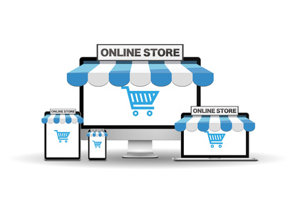
 Your website must be responsive so that your customers can order indiscriminately from a PC, smartphone or tablet. This point is also essential for the search engine optimization (SEO) of your restaurant’s e-commerce site.
Further reading:


